Dims


Many government affairs in The Netherlands are handled online in the Dutch language, which puts non-native speakers in a vulnerable position. That's why my team and I developed Dims (Dutch Immigration Search), at the behest of OBA (Amsterdam Public Library). DIMS is a website that aims to help people who struggle with integration affairs, language, and digital skills.
During our research, we found that there is no structured overview of what integration affairs people need to arrange first. And besides this, the information about this topic is scattered all over the internet. This doesn't correspond with the feeling of self-reliance, which The Netherlands is encouraging.


How to give digitally illiterate newcomers around Amsterdam simple access to trustworthy information regarding the integration process. Since this information is mainly available in Dutch, it can be difficult for non-Dutch speakers to find these reliable sources. For example, the importance of a DigiD. Besides this, it's hard to get to know the different organizations that exist in Amsterdam since they all operate individually. So, how do we guide immigrants to the organizations that offer help around Amsterdam?


Conducting peer reviewed research and analyzing this was very important during this phase. Together with the the many interviews with organizations around Amsterdam and observations we conducted we could pair our findings and decide which target audience needed our help most. With the multiple user journeys and prioritizing the needs and the wants we could understand better the obstacles people are facing. We decided to focus on a target audience that struggles with the language barrier while integrating in the Netherlands.
With the help of the refugee organization Vluchtelingenwerk and conversations with immigrants we realized that the Dutch system is complex. Our target audience needs a lot of guidance to follow the protocols to integrate in the Netherlands.
For instance, you should make an appointment with your general practitioner (GP) before going to the hospital. We discovered that there is no organized summary of what they must initially arrange. This doesn't correspond with the feeling of self-reliance, which The Netherlands encourages among its citizens and residents.


We continued with SPRINT week so we could create a working prototype to test with our target audience in a short period. To kick this week off we held a co-creation session with our client to make sure we have all the information we need from them.
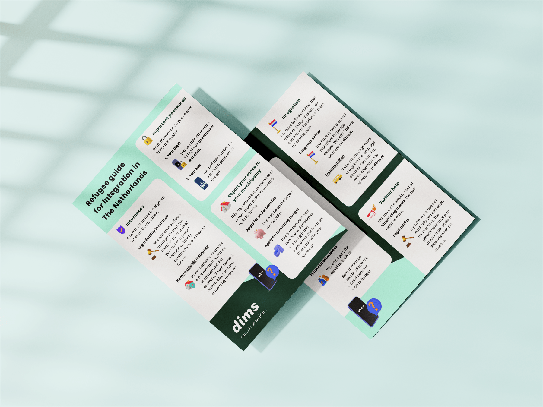
This led to the concept of creating a guide that consists of steps that the immigrant need to take care of. For example, report their move from the asylum center to the right municipality. Besides showing what needs to be taken care of during the integration in the Netherlands, it also provides guidance to the organizations in and around Amsterdam. This guide is written in the native languages of our target audience. We did the site map and wire-framing of the iteration and throughout the project, we user-tested it with Turkish and Arabic-speaking refugees.


Testing proved that our target audience thought the content in the guide was very valuable. However, they use platforms like Google and YouTube a lot. Also design convention such as hamburger menu’s and dropdown menus weren’t recognized by our target audience.


"Can I have the URL of this prototype, please?" — User tester
During the iteration phase we developed a new prototype with a search engine at its core. The translation function in the search bar on the homepage allows the user to find reliable information about integrating in the Netherlands from Dutch and English websites, as well as websites in their native language. With the help of the filters, we provide a customized search results page, so users don’t get misled by reading irrelevant articles.
For instance, normally you would need to use the Dutch word "huurtoeslag" to look for official information on rental allowance in The Netherlands. However, this option allows you to search in your own language, and all the articles with reliable information on ‘huurtoeslag’ will be shown. Additionally, the content in Dutch will also be translated into your language. To ensure reliability, we carefully select the websites that show up in the results.


In the first prototype, we produced a step-by-step guide, this is partially implemented in this second prototype. The guides are implemented as suggested articles on the Dims website since our participants are pleased with the valuable content in their native language. They can be found on the home page. Another feature we implemented was providing guidance to the organizations and their events in Amsterdam. To better assist our digitally illiterate users we designed a help button. This includes animated information on how features on each page work.
Testing proved that using the correct conventions is crucial for a good user experience. For digitally illiterate people, it's essential that they can relate to what they see. Instead of abstract line icons, we try to mimic the physical world by using 3D icons. In addition, we color-coded the user groups, so they understand better which content applies to them.


